The report your borrower opens at 10pm
Here is what happens to a beautiful PDF. You send it at five. Your borrower opens it at ten, on a phone, in bed, with the lights off. They pinch, they zoom, they scroll sideways to read a column, they land on the fee page, they have a question about one line of it — and then they close it and put the phone down, because it's ten and there's nobody to ask.
You hear about that question on Thursday. Or you don't.
A PDF is a document, and a document is a thing you read. What that borrower wanted was somewhere to poke at their own deal.
A place, not a page
An interactive report is a borrower-friendly web version of your report, at a private link only your client has. It's a third way to send a report, alongside the PDF and the classic static report, and it's built for a phone at ten at night.
They tap the link and they're in. No sign-in, no password, no account to create. The link itself is the key: it carries a random code nobody can guess, which is exactly why you treat it the way you'd treat the PDF and send it only to your client. It's short enough to text.
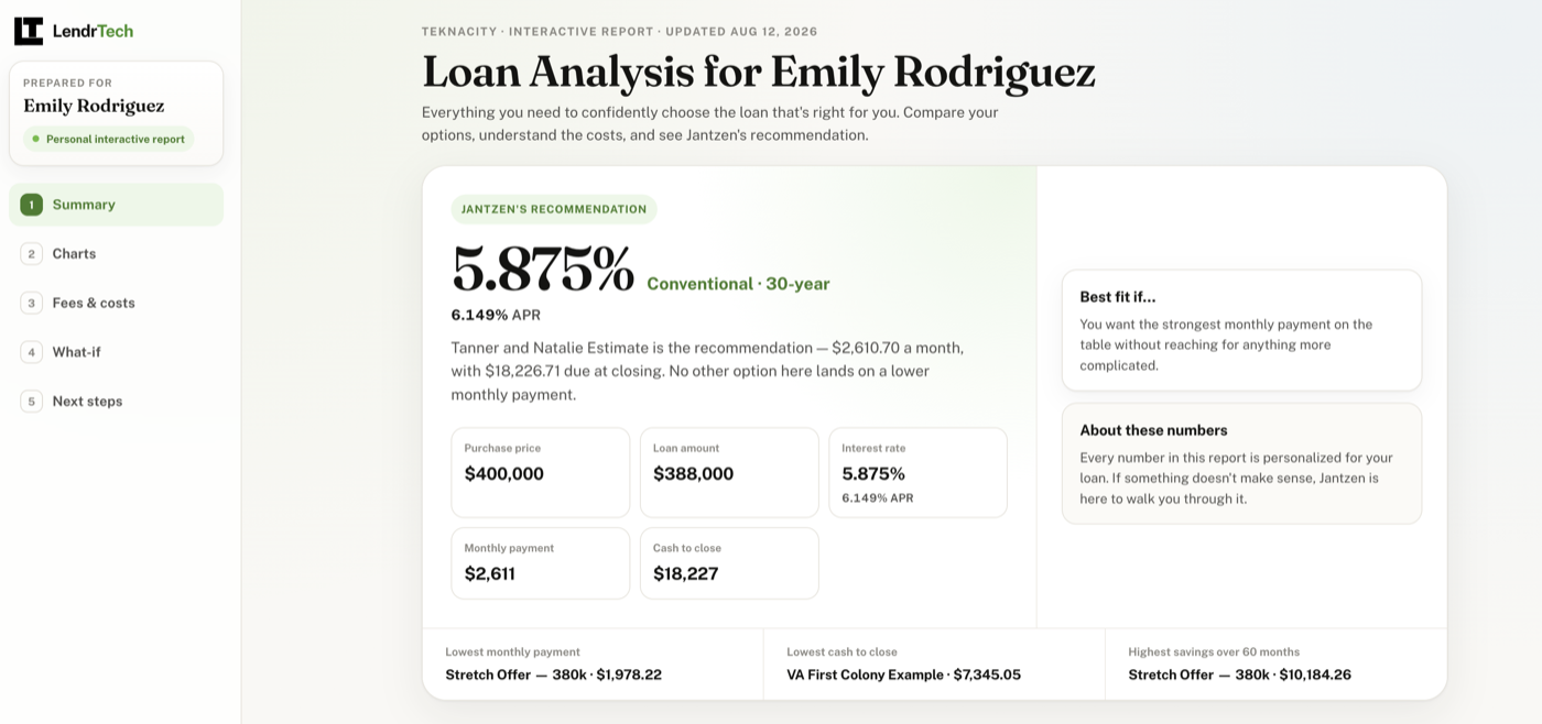
What they land on is a clean, tabbed report — numbered tabs down the side on a computer, a bar across the bottom on a phone. Summary first: the option you recommend, your note about it, the headline numbers, then every option side by side on its own card. Then Fees & costs, where the itemized closing costs and prepaids expand for the borrower who wants that detail and stay folded for the one who doesn't. Then Next steps — your closing recommendation, a short checklist, and one-tap buttons to call or email you. That last part is the whole thing, really: at the moment a question occurs to them, the answer is one tap away instead of four days away.
The tab that keeps them there
What-if is a payment explorer. Sliders for the things a borrower actually fidgets with — home price and down payment on a purchase, the loan amount on a refinance, plus the rate and the term — and an itemized estimate underneath that moves as they drag, so they can see which part of the payment changes rather than watching one big number wobble.
It's also honest about where it stops. The down-payment slider won't run past the point where the loan would change character, because past that line the page genuinely doesn't know the new number — so it says so and points your borrower back to you. The whole tab is labelled an illustrative estimate, not a quote and not an approval.
Each report type answers its own question
The layout follows the question the report is for, so the tabs differ by type. A purchase report gets five tabs, with Charts for the visual comparisons of payment, cash to close, and savings over time.
A refinance report asks something else entirely — should I do this at all, and how long before it pays for itself? — so it's built around the mortgage your client already has, and tab two is named Your savings instead of Charts. The mortgage they already have is drawn in a neutral grey wherever it appears, never in one of your theme colors, because your colors mean the options you're offering — painting today's loan as one of them invites your client to read it as another choice.
A single-loan report has one loan and nothing to compare it against, so it gets four tabs rather than five.
All three carry your branding, and your disclosures sit in a footer that stays visible on every tab.
Then you tell them why
The thing that makes a report land isn't the chart. It's the sentence underneath it that says which option you'd take and what it means for this family. That sentence leads the borrower's report, and it's yours to write.
In the report builder, open the report in Interactive mode and expand Recommendation & story. Pick your Recommended option — everything is written around it — and type the story yourself, or have the first draft written for you.
Optionally add a line or two under Tell me about your client — "first-time buyers, lowest payment matters, closing in three weeks." That note steers the writing and your borrower never sees it. Click Write the story, give it a few seconds, and the boxes fill in: The quick answer, Best fit if…, Final note — the same sections your borrower reads. Edit any of them until they sound like you. Each drafted box keeps an Undo AI pill in case you preferred what was there.
It writes the prose; it does not do the math. It will only mention figures already on the report or ones you typed into the brief — it won't total, subtract, re-derive or invent a number, and it won't round a rate or an APR. Asked to promise an approval it can't stand behind, it declines. And the story never depends on the AI: the moment there's something to write about, LendrTech auto-drafts every section from the report's own numbers, so the boxes are never empty.
Then you read it, fix it, and save. The saved story is what your borrower sees.
Sending it
Save the report first — an interactive report serves the numbers as they were when you saved. Then, in Interactive mode, Send emails your borrower the interactive link instead of the classic one. You can also drop the link into a message yourself with Insert link — see sharing reports with borrowers.
Nothing you already rely on goes away. You still get the same one-click PDF, and in Static mode a send still delivers the classic static report. The interactive report is an extra option, not a swap — for the borrower you know is going to open it at ten at night, alone, with questions.
Interactive reports and Write the story are Max features; see the pricing page for what's on each plan.
Where to go next
- Interactive reports — every tab, on all three report types, in detail.
- Write the story — the drafting flow and exactly what it will and won't say.
- Sharing reports with borrowers — what the link is, and how to treat it.
- Set up your branding — the photo, logo and disclosures that ride along on every tab.
Sent one and heard back from your client? We'd like to know what they said: team@lendrtech.com.